Introduction
Overview
Teaching: 10 min
Exercises: 10 minQuestions
Why do we need data visualization at all?
Objectives
Motivate data visualization as a tool to convey information
A Map to Our data
“By visualizing information, we turn it into a landscape that you can explore with your eyes. A sort of information map. And when you’re lost in information, an information map is kind of useful.” – David McCandless
Humans have been visualizing information for thousands of years. In our modern world, where the amount of data we collectively generate—both in academic research and in the wider world—is increasing rapidly, understanding the information contained in these data sets becomes ever more important for solving the pressing issues of our time, and also for understanding the new problems the usage of these data sets for decision making might create in the first place.
You have all used data visualizations in the past. A map, be it an old-fashioned paper one or an electronic map on your phone, is a visualization of spatial data. It is interesting that David MacCandless, in his quote above, compares data visualization to the generation of a map. Maps are some of the oldest ways of visualizing information, and remain one of the best examples of effective communication.
Exercise: Maps as Data Visualizations
Take a look at a map, any map. This could be an online version, such as Google Maps or Open Street Maps, or a topographic map for hiking, or a map you hand-drew on paper to let your friend know how to find you.
What catches your eye first? What are the different types of information that are represented on your maps? Which are represented purely visually, which are represented as both text and visuals, and which are purely textual representations? Which information, do you think, did the mapmakers consider most important? When using an online map, how does the display of information change as you zoom in and out? Which information is considered most important at the different zoom levels?
A Closer Look at a Map
Unlike most forms of data visualizations, maps have to be a lot of things to a lot of different people. They have to convey different types of information for a large range of different purposes. For example, you might be trying to drive to your friend’s house, so you need to know where streets and intersections are, which streets are highways and which ones aren’t, so that you can plan the fastest route. On the other hand, a hiker out in the country might be particularly interested in altitude differences, so that they can plan a route that is not too steep (or a route that’s especially steep, if that’s your jam!).
In general, all visualizations possess what’s called a visual hierarchy. That means that things that are important should jump to your eyes first, and things that might be less important are shown later. Take a look at the OpenStreetMap map for the United States. To do so, go to Open Street Maps and zoom out until the entire continent becomes visible. Depending on where you are in the world, move around that map until your map is centred on the United States (or you could use the continent you’re on!), then zoom in until you see most of the country and some of its surrounding countries or oceans.
What you find should look something like this:
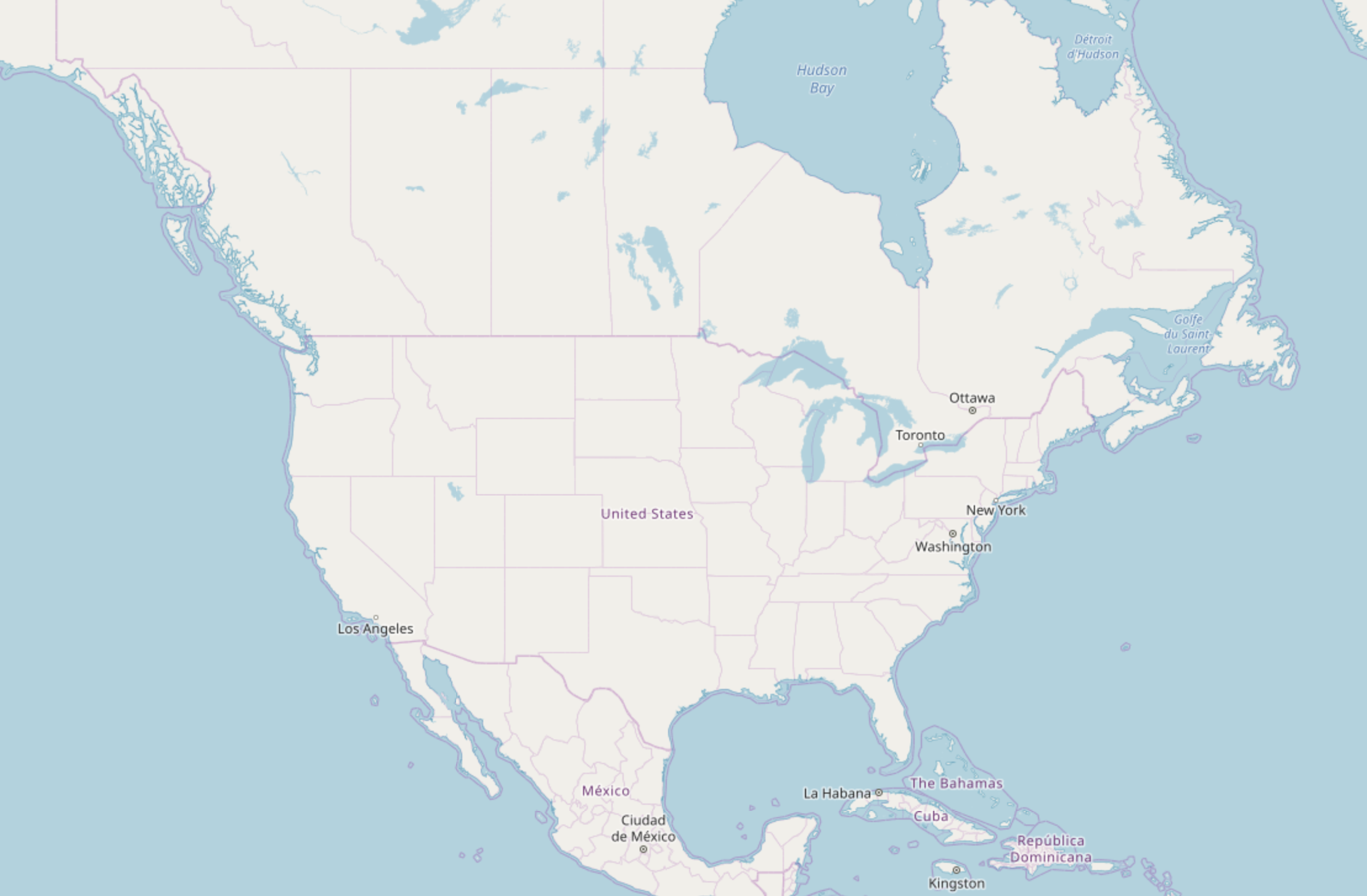 Image Source: Open Street Maps
You should be seeing the North American continent (or your own) in white, surrounded by the blue of the ocean, with borders in purple, the country names in purple, and the largest cities marked in black. There is a lot of information to unpack here! Where to look first? You might find that your eye is guided naturally to certain points: the contrast between land and water, the thick purple borders between countries, the black text of the city names. That is exactly what the mapmakers intended!
The most important point you should keep in mind when reading on is this:
Attention
Data Visualization is about managing the viewer’s attention.
In this respect, visualization is a little bit like being a magician, but in reverse. Magic tricks are also very much about managing the audience’s attention: most tricks involve some kind of distraction that the adience’s focus is directed to, while the magician may do the actual trick undetected. In data visualization, we are doing the reverse: we are trying to direct the viewer’s attention towards the most important pieces of information, rather than away from them.
On our map, at this large-scale view of the entire continent, the user probably doesn’t care about the smaller cities, so they’re not shown at all. The map makers have also used colour judiciously: in general, we associate blue with water, so they’ve coloured the oceans blue. You could colour them any colour you want, but I suspect it would be very confusing if you coloured the oceans red, and a viewer might no longer understand how to interpret the information.
So here, then, is another important point to keep in mind:
Accessibility
A visualization should always strive to make it easier for the widest possible range of viewers to understand the information conveyed.
I deliberately use the “widest range of viewers”, because just because you understand a visualization well does not mean everyone will. We will get back to this point in the episode on accessible visualization design. What makes a visualization easy to understand is also closely tied to how our brains process visual information. We will take a closer look at that in the episode on pre-attentive processing.
The map makers at OpenStreetMap deliberately did not make the continent blue, that would be confusing, too. We will talk more about colour and its role in visualization in the episode on colours.
If you look at the borders drawn in purple, you might notice that some lines are thicker than others. The thicker lines are the borders of countries, the thinner lines borders of states. Thicker lines are easier to encode than thinner lines, thus the mapmakers made the more important boundaries thicker and easier to recognize. This is an example of visual hierarchy, which we will look at in the episode on Gestalt psychology. Related to this concept is also the fact that the country names are coloured in purple, which your brain might therefore immediately associate with the borders. Similarly, names of oceans, seas and lakes are coloured in a darker blue, which you might more easily recognize as the name of that body of water. Association, too, is a Gestalt principle.
You might also notice that the mapmakers only convey a subset of the available information at this level, like the names of the countries, but not states, and only the largest (or most important, by some metric of importance) cities. This has both practical and conceptual reasons. If the mapmakers included every town and village at this level, the entire continent would be crowded with writing and we could see nothing at all. But also, one important concept within the idea of visual hierarchy is the concept of space. It is much easier to make sense of the important parts of a visualization if the individual elements are surrounded by space, rather than other elements. We will get back to the topic of (negative) space in the episode on Space.
Finally, it should be noted that in what I said above, the word “important” appeared multiple times. It is important to recognize that when the mapmakers at OpenStreetMap came up with colours and shapes and what to include and what to leave out, they curated information. They made a myriad of small and large decisions about what is important and what isn’t, what belongs together and what doesn’t, and these decisions encode their own implicit understanding of the world.
Here, then, is another important point to keep in mind when delving into the world of data visualiztion.
Subjectivity
Data visualizations are not objective tools of conveying information. Their creation requires a multitude of minor and major decisions, which in turn encode the maker’s personal understanding and sometimes biases about the world.
We will return to this last point, including the ethical aspects of generating a visualization, and some examples of using visualizations for mis-information, in the episode on Visualizations & Society.
What Not To Do
We are going to end this introduction with an example of how not to visualize some data, from the Canadian newspaper The Winnipeg Sun:
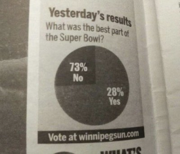
This could be, in principle, a visualization that is straightforward to understand, yet it fails in several hilarious ways. First, you might notice that the question “What was the best part of the Super Bowl?”, an American sports event, is in no way answered “yes” or “no”. Context is important in data visualization! Here, the context is completely mismatched to the information on the visualization itself, so we have no way to interpret it!
In general, much has been said about the use and mis-use of pie charts. There are many in the data visualization world who argue against ever using them, because humans are worse at estimating angles and circumference (which is how data is displayed in a pie chart) than they are at comparing lengths and areas. Pie charts are generally used to show parts-to-whole relationships, i.e. data sets where all the individual components must sum up to 100%. In the case here, that’s in principle not a bad representation of the questionnaire (for yes/no questions, you’d hope that the total sums up to 100%), except for two glaring problems: the numbers on the chart don’t actually sum up to 100%, but 101%! Where is that extra 1% coming from? We’ll never know!
The second issue is the labels are reversed: the 72% “no” answer is printed on top of the smaller pie slice, the 28% yes on the larger pie slice. This is super confusing! It’s like taking a map, and making your continents blue and your oceans red. What are we supposed to get from this? Well, probably that someone messed something up But what? Are the numbers correct, and they just switched out the labels? Are “yes” and “no” correctly associated with their pie charts, but the numbers are switched? What happened here? I suppose newspaper printing is a stressful business, and occasionally things slip through without being checked carefully. But this is a good lesson to ask before you submit your next paper or proposal: does the information on my plots actually make sense? Is the context (captions, axes, labels, etc.) consistent with my visualization?
Key Points
Visualizations are an important method of interacting with information.
Maps are great examples of visualizations: studying maps can help us understand how to convey information effectively
Visualization is about managing the viewer’s attention.
Visualizations should be accessible to the widest possible range of viewers.
Visualizations are not objective tools of conveying information. They can be misused to manipulate.
Context is important: make sure your context and visualization agree with one another!