What makes a visualization effective? Co-creating best practices
Overview
Teaching: 5 min
Exercises: 35 minQuestions
What makes a data visualization effective at communicating information?
Objectives
Critically engaging with the way data is presented visually
Articulating what parts of the visualization are effective, and which ones aren’t
Distilling general rules for creating or modifying visual representations of data.
Familiarizing learners with design practices like wireframing
In the introduction, you got a first idea of the kinds of things we’ll be talking about. But I’ve also mentioned that you have likely all seen data visualizations of one form or another in your lives. Because reading and interpreting data visualizations is fairly closely tied to perception, you already have some understanding of what makes a good representation of information.
So we’re going to delve right in with an exercise.
Interpreting Data Visualizations
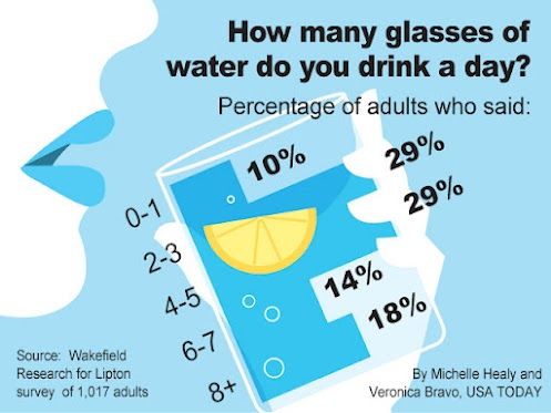
Let’s start with two examples of data visualizations. The first comes from USA Today, and describes the number of glasses of water adults drink per day:
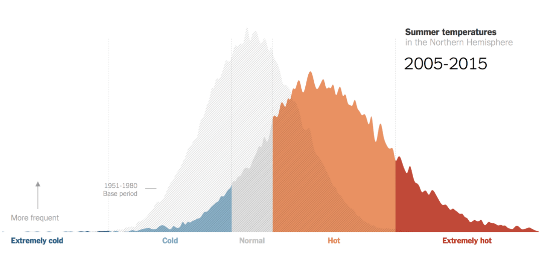
The second visualization comes from the New York Times, and shows how often the Northern hemisphere experienced certain temperatures, compared to a base period (this is actually a screenshot of an interactive visualization):
For this exercise, pick one of the two data visualizations, then look at the questions below and note down some observations. Take 5 minutes for this task.
- What do you think is the main point or piece of information this visualization is trying to convey?
- What elements of the visualization help you understand the information that is being conveyed?
- What elements would you change or improve in order to make the meaning clearer?
When you’ve written down your observations, find someone in the room who picked the other visualization. Compare your notes (take 10 minutes for this task):
- Can you distill general guidelines for designing good data visualizations?
Find another group of 2 and together, collect all your general guidelines and share them with the group in this document (15 minutes).
Important: Make sure you look at the best practices for working in a group below, and keep them in mind when sharing ideas in your groups!
In the last 10 minutes of this exercise, we will discuss the co-created guidelines and best practices together as a group.
Well done! I am going to bet that together, you came up with a pretty comprehensive list of best practices! Now let’s delve a little deeper into those principles, and why they work.
Best Practices for Group Exercises
- Share space and time: All of our exercises are time-bounded. That means you are all collectively responsible for making sure everyone in your group gets a chance to participate. Keep this in mind when sharing ideas and discussing projects!
- Listen to each other: Give each other space to speak, without interrupting or talking over who is currently speaking. If someone tends to monopolize time, gently remind them to share the time
- Encourage one another: Everyone here comes to this tutorial with a different background and different experiences. Some of you might have learned about this topic before, others might not. Invite especially the junior members of your group to participate, but don’t put anyone on the spot, and appreciate the experiences that everyone brings to the table.
- Use positive and inclusive language: Avoid value judgments in your language, like “this is stupid” or “I can’t believe you don’t know this”. These statements are exclusionary, and not helpful! There are other subtle language cues that sound harmless, but might make it harder for your group members to participate, like “This is easy” or “simple”, or “You can just […]”. Be on the lookout for that language.
- It’s okay to slip up: Slip-ups will happen. If someone calls you out, thank them for their feedback, move on and do better next time!
Key Points
All of us have interacted with visualizations in one form or another.
Use examples of data visualizations to co-create best practices.