Working with Colour
Overview
Teaching: 0 min
Exercises: 0 minQuestions
How can we use colour effectively to convey information and highlight imporant key points?
Objectives
Understand the role of colour, relating back to pre-attentive processing
Understand the difference between hue, saturation and luminance
The role of luminance and saturation in images: spatial frequency
The role of luminance and its relation to greyscale: perceptually uniform colour maps
Designing colour maps for viewers with impaired colour vision
Combining multiple channels of information (shape, size, colour) can help convey information.
In the episode on visual processing, we have learned that colour is one of the strongest pre-attentive discriminators. Certainly, colour is one of the most common ways to distinguish different elements and to highlight important information. Much has been written about the use and mis-use of colour in visualization. Here, we are going to talk a little bit about how we generally perceive colours, and how as designers, we can work with our visual system to use colour effectively to convey information.
When designing the colour information for your visualization, there are three important questions to keep in mind:
Key Questions
- How does it look in colour?
- How does it look in greyscale?
- How does it look for colour-blind viewers?
It isn’t enough to choose a good, descriptive colour palette. One important consideration is whether your different colours interfere with one another and cause visual confusion. But also, you need to keep in mind that not everyone will see the same figure as you, on the same type of screen. Many readers prefer to print out documents, and often these documents are printed in black and white only. An element that pops right into your attention on the screen because of its distinctive colour might be completely indistiguishable on black-and-white printed paper. Similarly, we have already talked about designing for accessibility, and making your visualizations friendly to readers who are colour-blind is an important design consideration.
Much of this episode comes from the book “Information Visualization: Perception for design” by Colin Ware, which does a fantastic job of summarizing the perception of colour in Chapters 3 and 4.
The Perception of Colour, Part 1: Luminance
When we colloquially talk about “colour”, we actually tend to mean two distinct things that are closely related, but worth discussing separately: the perception of luminance, and the perception of colours.
Luminance is a physical quantity: it is the energy per square area, weighted by the sensitivity function of our eyes. It describes how “bright” something is (e.g. a lamp) to our eyes. In astronomy, we would call this the flux that is measured by a telescope, i.e. the photons that are recorded by the camera. Because it is a physical quantity, it is convenient, but it is also worth noting that it is not that closely tied with our perception of brightness: our eyes do not objectively measure brightness, but they’re effectively change meters: they measure the difference between a given patch in our visual field to a neighbouring patch, or the change in brightness in that patch from one moment to the next.
Take a black sheet of paper out into the midday sun, and compare it to a white piece of paper viewed in an office without daylight. In absolute terms, if you measured the light reflected by each, the total amount of light reflected by the black piece of paper in bright sunlight will likely be higher than the light reflected by the white piece of paper in the dim office. Yet you will likely be able to tell which piece of paper is black, and which is white.
There’s a good reason for this property of our eyes: between your bedroom at night, and sitting outside in the midday sun, there are about six orders of magnitude in absolute difference in brightness. Yet most of us can still find our way to the kitchen in the moonlight, and while we’re momentarily blinded when going outside (that’s the cells in our retinas adjusting to the sudden change in brightness), we can generally still see pretty well even in very bright conditions.
That our eyes can reliably work across such a vast range of different levels of luminance is remarkable, and only works because we generally don’t need to understand absolute luminance levels, but just the relative luminance levels between different objects in our vision.
Luminance is crucial to human vision in many different ways, much more so than colour vision is. Luminance helps us understand form and position of objects in 3D space. Consider the black-and-white photo below of someone holding a pool ball:
 Image Source: Adapted from Unsplash/Hari AV
The image is entirely in greyscale, and yet, our eyes can generally understand that a person is holding a ball just over the table, and we can see that they are holding a spherical object, rather than a flat paper cutout. Our visual cues come in the form of brightness differences between the background and the ball, as well as the the brightness differences on the ball itself: it is lit from the top, and the gradual fading into darkness gives us an idea of the ball’s 3D structure.
What we cannot tell from the image, however, is how bright the room was that this picture was taken in: was it a dim billiards hall? Was it a brightly lit competition? We can’t tell from the image, because our eyes only make sense of the relative differences between the ball and the background.
There are a number of optical illusions related to the relative perception of luminance, which are relevant to data visualization, in particular simultaneous brightness contrasts. This refers to the effect whereby a patch of grey on a dark background will appear lighter than if the same patch of grey is viewed on a very light background. As an illustration, take a look at this image:
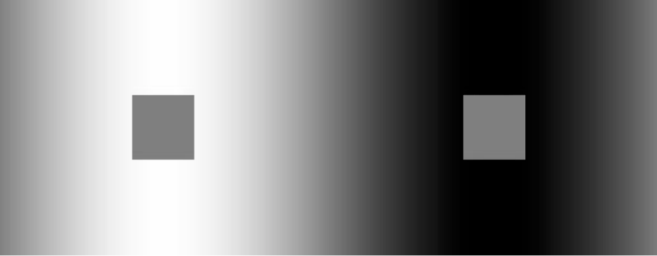 Image Source: McCourt, Blakeslee and Kingdom (1997)
Generally, the patch on the left will appear darker relative to the grey patch on the right, even though they are the exact same shade of grey!
Together, our relative perception of luminance and the importance of luminance in perceiving shapes have important consequences for data visualization:
Luminance in Visualization
Use luminance in a visualization when it is important for readers to understand the shapes and form of the data being shown (for example for showing large-scale weather patterns). Do not use greyscale and luminance contrasts only when it is important for readers to read absolute values (e.g. the temperature for Seattle tomorrow) off the visualization using a key (e.g. a greyscale bar), because estimates will be severely biased by the surrounding parts of the visualization.
The Perception of Colour, Part 2: Hue and Saturation
Between luminance and colour, luminance is vastly more important to our everyday lives than colour
is, because it helps us understand our 3D world in a way that colour doesn’t. However, colour is
still useful in a number of contexts, and data visualization is one of them.
It has a critical function in determining the material properties of some objects. As such, think of
colour as an attribute of an object, rather than its primary characteristic. For example, a hot
stove might have a reddish glow. This glow might not be easily apparent in greyscale (especially if
the background isn’t black), but will be more obvious in colour space, warning us not to touch the
hot surface.
Our eyes parse colours through three different types of cells, all called cones in our retina. Each type of cone has a different response to different wavelengths: some cones respond to the redder part of the spectrum, some to the bluer parts. If you’ve ever wondered why TVs have three types of pixels (red, green and blue) or if you’ve come across typical colour systems in visual design (like HSV or RGB) tend to have three dimensions, the reason lies in this fundamental property of our visual system, which makes arrangements of colours in a 3D space a meaningful concept.
Colour-blind individuals often lack one type of cones, and this inherently three-dimensional space collapses to a 2D plane, leaving some colour combinations (particularly red and green) that are easily confused. Colour perception and interpretation is remarkably constant across cultures and languages: in a study of 100 different languages, researchers found a clear and consistent hierarchy of colours. Black and white are almost always present, and if a third colour exists, it is always red. The fourth and fifth colours generally added to the spectrum and yellow and green (although the order tends to vary), and the sixth colour added is always blue. This suggests that there is something universal about how we process colours.
The perceptual space in which the combination of colours and luminance lives in our brains is fairly complex and multi-dimensional. Existing systems for computer screens and printing can only really approximate this internal representation through various standards. One common standard used is called HSV, which stands for hue, saturation and value. The last of the three can be directly related to luminance: it describes where the colour is located on a scale from white to black. Hue describes the quality of the colour itself in a space spanning some set of primary colours, such as red, green and blue. Saturation, finally, describes the vividness of a colour: high saturation colours will be vibrant, such as the red of a traffic light. Low-saturation colours will look washed-out and grey.
Exploring Representations of Colour Space
If you have worked with a text editor like Word or Pages, or a presentation programme like Powerpoint or Keynote, you have come across different representations of colour space!
Open your favourite text editor, presentation programme or drawing programme. If you don’t have a text editor or presentation programme installed, you can also take a look at the [HTML Colour Code website][htmlcodes], which is meant to help you pick colours for a website.
For any shape or text you enter (except in the HTML Color Code website), which displays the colours directly, you should be able to change the colour. What is the representation of colour space this programme gives you? Which axes are represented where? Can you find luminance, saturation and hue?
Using Colour in Visualization
Because luminance and colour fulfill different functions in our vision (luminance helps us understand form and locations of objects, colours tell us about their physical properties like whether a stove is hot), they are also useful for different things in visualization.
As we’ve mentioned above, luminance is excellent at bringing out shapes and forms, for example in 2D maps of continuously varying quantities. But because luminance depends on relative contrast to its surroundings, and because we can generally only distinguish three to four different values in luminance at a time, they are less useful as discriminators of absolute values, such as temperatures, or the difference between data sets on a scatter plot. Here is where colour comes in!
Colour, on the other hand, does not help us understand position and shape of an object, thus whenever shading an object, make sure to use adequate luminance contrast to ensure the shape will be perceived correctly. Because saturation describes how pure a colour will appear to the viewer, when using saturation to describe continuous quantities, use higher saturation for larger values, because that is how we tend to perceive saturation.
Colour is often used to describe different groups of data points on a plot, or different lines on a graph. This is also called nominal information coding, whereby you use colour to denote different categories. In order to help viewers clearly distinguish these groups, points or lines, it is helpful to choose colours that are far apart in hue and saturation. In Episode 2, when we discussed accessibility, I mentioned that you should use colours that are accessible to viewers who are colour blind. We can now make this more specific: because the majority of colour-blind viewers will have trouble distinguishing red and green, choose colours that have variation of the axis spanned by yellow and blue. These colours will generally be easier to distinguish than red-green, blue-green or yellow-red combinations.
It is also important to note that we don’t have an infinite capacity for distinguishing different types of colours. A somewhat tongue-in-cheek discussion of this fact can be found on the blog of the popular webcomic XKCD, which ran a survey that asked readers to name different colour hues. The results are interesting, and allude to an important visualization guideline:
Limit Colour Use
When showing different categories in a visualization, keep the number of different colours to ten or less. Beyond ten hues of colours, differences may become too hard to distinguish effectively.
While we have discussed colour and luminance somewhat separately, they should in practice be used together. In particular, it is important to ensure that there is sufficient contrast in luminance between visualization elements and the background, especially if you think that a viewer might print the figure in greyscale. I once had a physics lecturer whose slides used light blue writing on a light pink background. Aside from being hard to view on the screen, when I printed the slides for my studies, I found I could not see any writing at all, because the luminance of both colours that this lecturer used were the same!
Take a look at the example below. On the left side, I made sure that there was a contrast in luminance between the text and the background. On the right side, I worked quite hard to make the colours of the background and the text equal in luminance. If you’re like me, the left side will be hard to read even in colour:
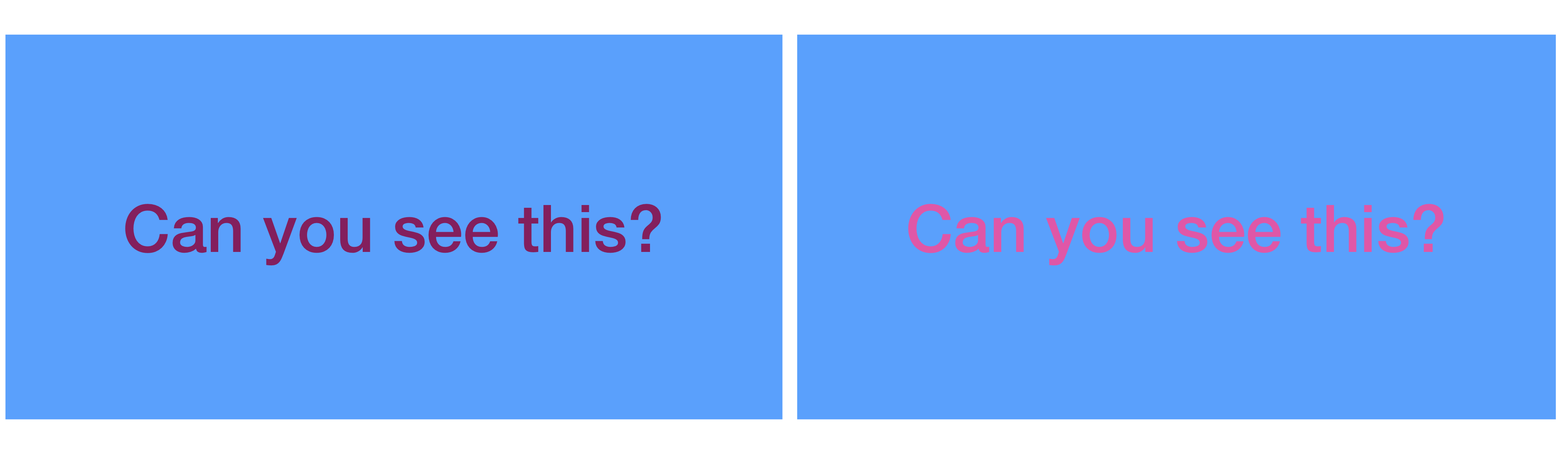

In the greyscale version of the same image, however, the writing on the right panel becomes almost impossible to read. When you design visualizations, ensure a luminance contrast between your important visualization elements and the background, especially if those elements are small symbols or thin lines, which will be almost impossible to see otherwise.
One other strategy you can take is to put a border around your important elements that has a strong luminance contrast with both the background and the important visualization elements. In the example above, both the writing and the background are about halfway between black and white. Let’s take just the right side and see what happens if I put a very light or very dark boundary around the writing:
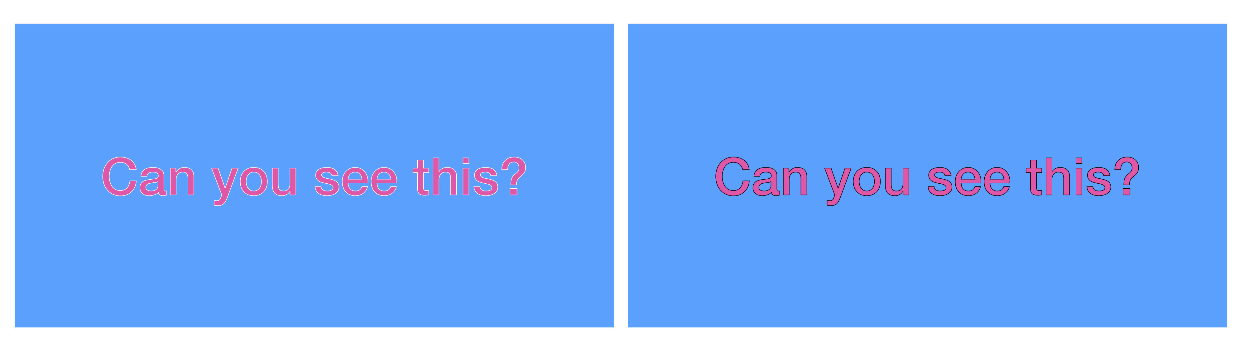
The fact that the original rectangle with writing on the right is hard to read even in colour, because both background and writing had similar values of luminance and saturation, is important in another context. Research finds that it is generally difficult for viewers to perceive small symbols and thin lines effectively when their colours have a low contrast in luminance with the background, or are very desaturated. Similarly, large areas of very saturated colour can overwhelm viewers and make it difficult to pick out the important information.
This leads to another useful guideline:
Use Saturation Effectively
Use de-saturated, pale colours (e.g. pastel colours) for large backgrounds overlaid with symbols, and use highly saturated, darker colours for the symbols and important figure elements superimposed on the background.
Maps are especially great at this last principle, because they generally try to convey a large amount of information, with some of it in background colours, and some of it in lines and symbols superimposed.
Take a look at the map of the Seattle, WA area (located in the Northwestern United States) below:
 Image Source: Open Street Map
Here, the mapmakers have generally used less saturated and lighter colours for shaded background regions like grey for city areas, blue for water and green for forests and parks. Small and thin elements, such as lines denoting roads, park boundaries and text, use a darker and more saturated colour.
##@ Colour Maps: Use With Care
In astronomy, as in other fields, it is common to represent continuously varying map values using a sequence of colours. This is called pseudo-colouring or choropleth map. Here, you essentially use colours to denote some kind of continuous value. You can also find this in topographic maps, where different colours (green for valleys and lowlands, brown for hills and mountains, and white for the highest peaks) are used to denote height above sealevel in a way that mirrors our everyday experience, making the map easier to read.
Often, however, the value we are trying to display, for example temperature, or wind speed, does not have an easy colour equivalent. In this case, we are free to choose whatever combination of colours we choose! However, not all colour representations are created equal, and not all display the same information equally well.
For a very long time, the most popular colour map has been one that approximates the physical spectrum in some sense, going from purple and blue across green and yellow to red, and back to purple.
Below, you can see an example of the jet colour map in Python, which was the default colour map for a long time:
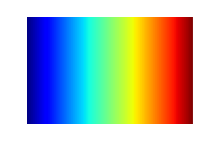

One thing you might notice in the greyscale version (below), is that the colour map is not uniform in luminance: both the red and the blue have approximately the same luminance. As we’ve seen below, we generally take our cues about forms and shapes and 3D structure from luminance differences. Because luminance here does not follow a monotone pattern (it rises from blue to green and then falls back to red), it can be very difficult to parse overall patterns when displaying information using this colour map. At the same time, we will also be unable to distinguish the red from the blue when printing the visualization in greyscale, making it even harder to understand.
This has generally led designers of data visualizations away from using this type of colour map, towards what are called perceptually uniform colour maps, i.e. maps where luminance rises or falls monotonically from one end of the colour map to the other. The documentation for the Python visualization package [matplotlib][mplcolour] has a nice visualization of the different types of colour maps implemented in it, and what they look like in luminance.
Exploring Colour Maps
Take a look at the different colour maps implemented in matplotlib, and how they distribute in luminance space. Can you think of cases where a perceptually uniform colour map is necessasry? Can you think of cases where it isn’t, and you might be better off using a colour map that isn’t perceptually uniform?
We have learned earlier that luminance is great for discerning form and shape, but not for absolute values. When it is important to read absolute values off a map, it may be more useful to use a colour map that is not perceptually inform, but includes a larger range of different colours (this would generally be difficult to do using pure greyscale anyway). In cases where both are important, researchers suggest using a spiral colour map, so called because it circles through all available colours, but also changes luminance monotonically from dark to light at the same time. In the case of the jet colour map above, one might start with a very dark blue, and as colours change also increase luminance, ending with a very light red.
Key Points
First key point. Brief Answer to questions. (FIXME)