Wireframing a Visualization
Overview
Teaching: 0 min
Exercises: 0 minQuestions
Can we design a better representation of an existing data set and visualization?
Objectives
Critique an existing visualization in a group
Identify a better representation of the given visualization.
Wireframe a new visualization on paper.
You’ve now learned a lot about the different types of data visualizations, about how our brain processes information, and how to use that knowledge to design visualizations that are easy to understand. Let’s now put that knowledge to good use!
When confronted with a data set, we often say “oh, let’s just quickly plot this”. Often, these plots might become what we put into our papers, posters, blog posts and presentations. But because visualizations are so good at conveying important information, it’s worth pausing for a minute, and thinking about whether the design you’ve chosen intuitively when you did your (perhaps exploratory) data analysis is the best way to present this information to new viewers.
After all, you understand your data, and the underlying scientific problem, incredibly well! But how would someone without your background look at a figure? Would they understand what all the components are? Would the main point you’re trying to make be as obvious as it is to you?
One concept that can help you here is to create a wireframe. They are often used in web development, where they denote a sketch (on paper, a board, …) of the layout of the page. This has two advantages:
- You can draw and re-draw your visualization many times, with fairly low effort. Trying to program multiple visualizations may be tedious and time-intensive.
- There is research that we are more likely to both give and receive feedback on drawings, compared to designs created in a computer. People tend to view computer-generated figures and designs more like finished products, and because you spent more time creating them, you might be more emotionally invested in your computer-generated figure. Drawing out a concept on paper or a board is a good way to get helpful feedback from others!
So let’s practice creating a wireframe for a data visualization!
Challenge: Wireframe a Visualization for Fun and Profit (okay, just fun!)
Below this challenge, you will find a gallery of data visualizations. All of these were drawn from public sources like newspapers, companies, design agencies, etc.
For all of them, there is room for improvement. In particular, they all share the fact that the values of the relevant data had to be part of the visualization, which is usually a bad sign. That does not mean we should never include our data on a figure: sometimes, including contextual information (legends, values of data points, …) can greatly increase legibility of the figure. However, if the only way to make sense of what is shown on the visualization is to include the entire data set on it, something odd is going on, and it might be time for a redesign.
Thankfully, we’ve got you! Team up in groups of four, then pick one of the visualizations. Use the three questions from the first exercise to guide your discussion of the figure, and how you might apply the principles you have learned and co-created yourselves to design a new version of this figure. As a reminder, here are the three questions from earlier:
- What do you think is the main point or piece of information this visualization is trying to convey?
- What elements of the visualization help you understand the information that is being conveyed?
- What elements would you change or improve in order to make the meaning clearer?
Take a large piece of paper, and pin it to a wall. Then use the crayons to draw a wireframe version of your new data visualization.
This process should take ~30 minutes, so make sure you budget your time well! In the last 15 minutes, you will be able to share your ideas with the rest of the group.
Here are some visualizations for you to choose from:
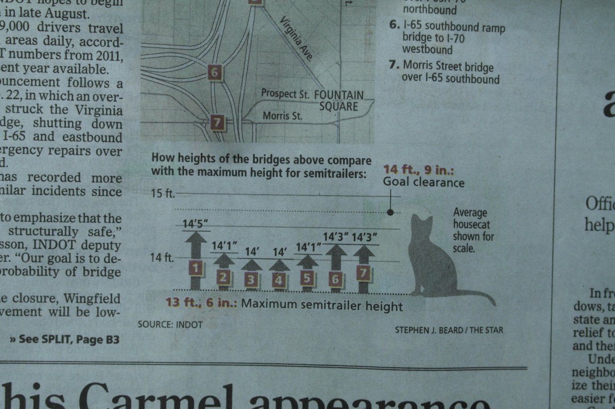 Image Source: Indianapolis Star, via Flowing Data
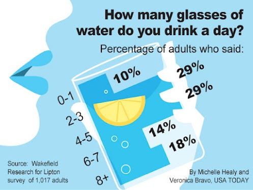 Image Source: USA Today, via the Calling Bullshit lecture 6 videos
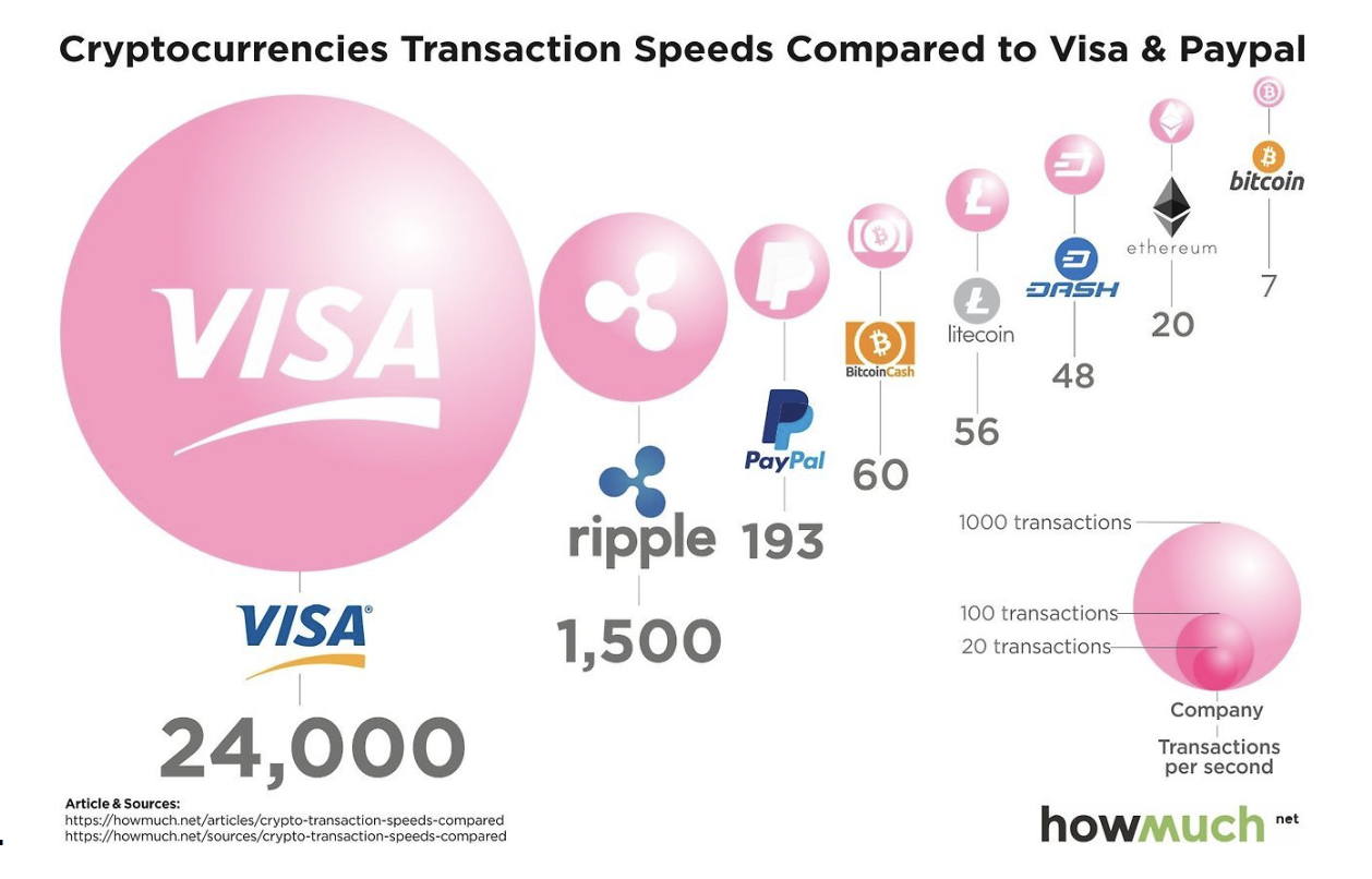
 Image Source: Jared Fanning, via Business Insider
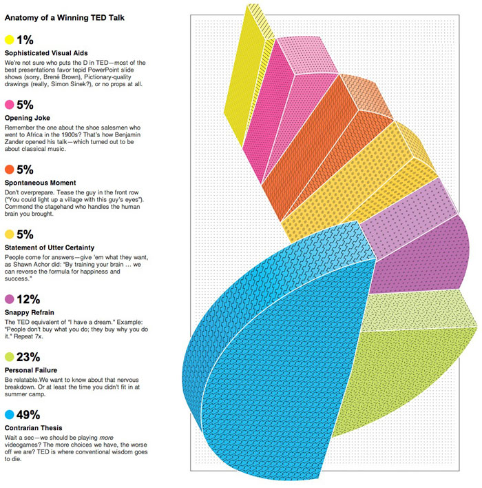 Image Source Wired, via Design Your Way
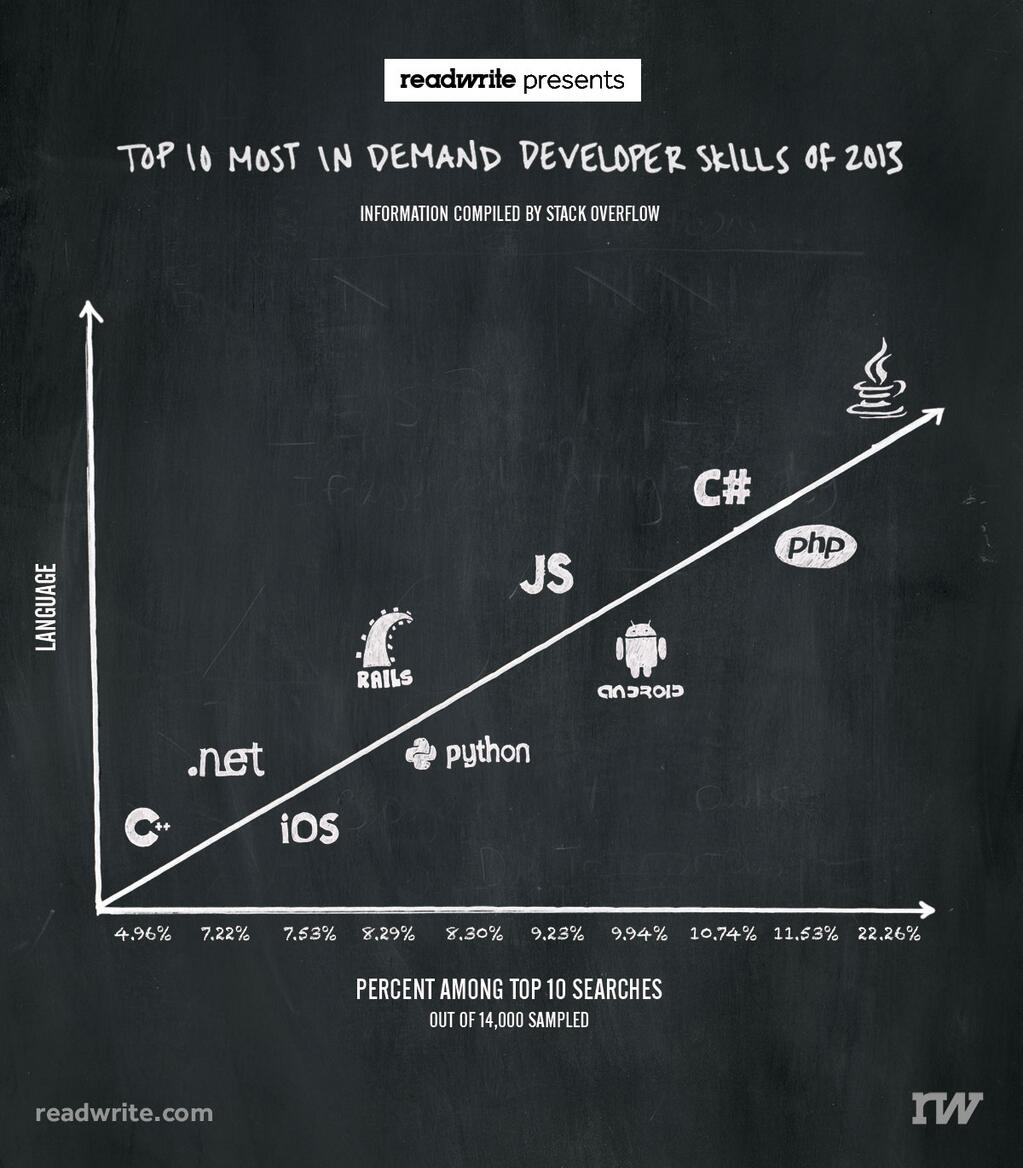 Image Source: ReadWrite, via Stephanie R. Taylor’s lecture notes
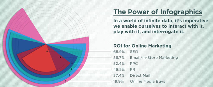 Image Source: Found on Design Your Way
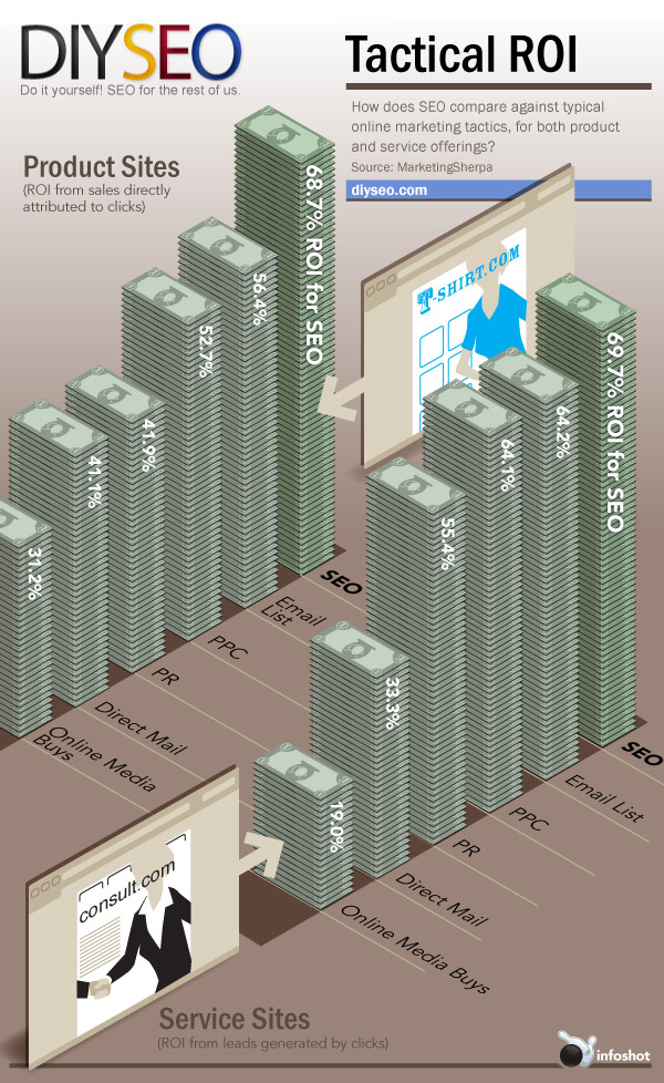 Image Source: DIYSEO
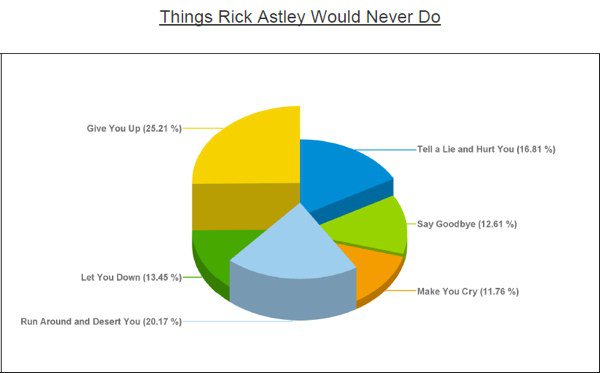 Image Source: WTF Viz
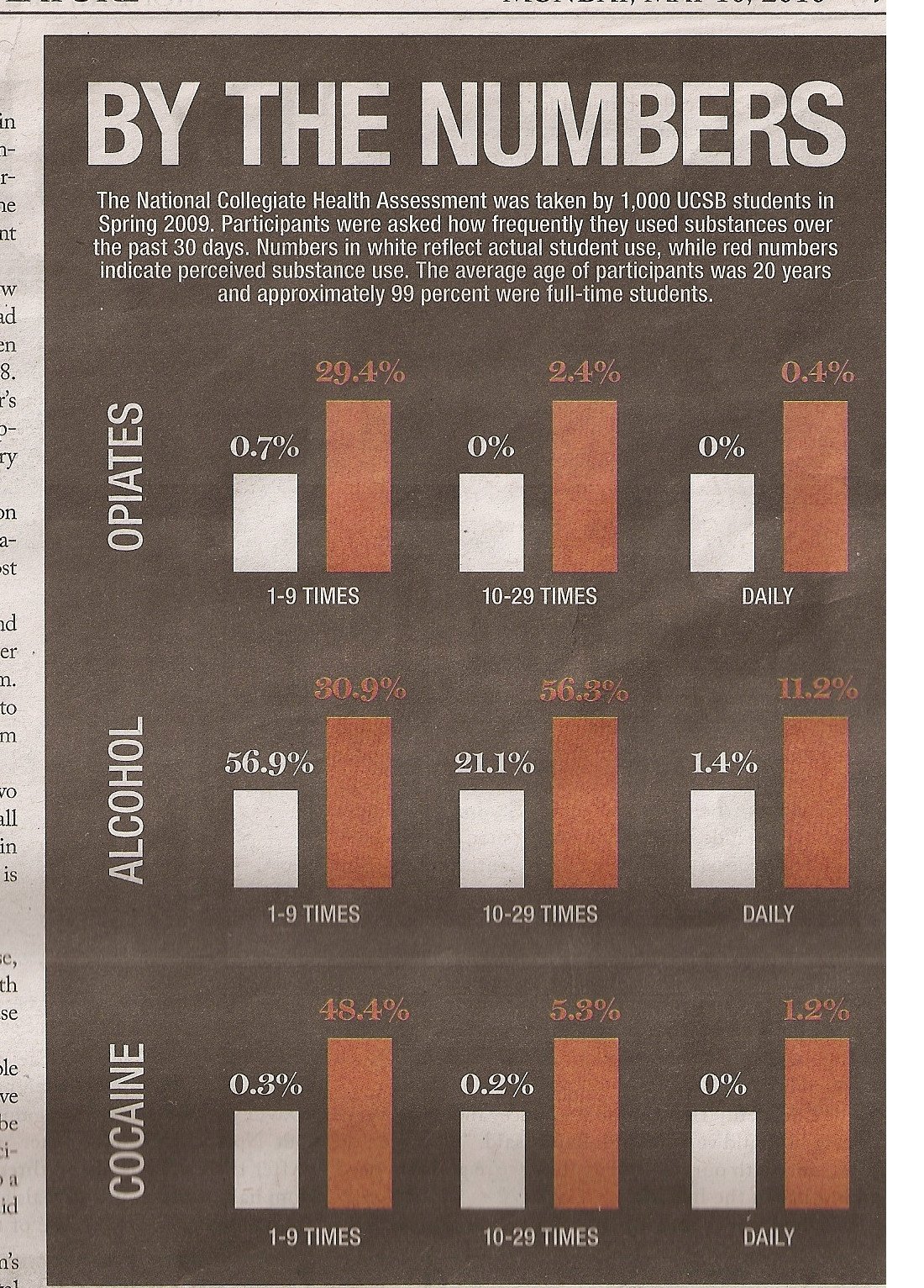 Image Source: UCSB by the numbers via Eager Eyes
Original source unknown.
Image Source: UCSB by the numbers via Eager Eyes
Original source unknown.
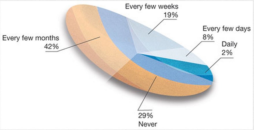 Image Source: Razorfish, via Eager Eyes
 Image Source: Stephanie R. Taylor’s lecture notes
Some more resources for data visualizations (and discussions thereof)
Key Points
Wireframing is the practice of designing on paper before going to the computer.
Wireframing is common practice in web development, and helps us proto-type and discuss visualizations.
We are more likely to give and accept feedback on sketches than on computer designs.
Improving a visualization is fun!