Space
Overview
Teaching: 5 min
Exercises: 0 minQuestions
How does our understanding of visual information relate to space?
How can we use (negative) space effectively to highlight important information?
Objectives
Understand the concept of (negative) space
Relate the concept of space to practical approaches to visualizing data
When we talk about space in data visualization, we don’t mean Outer Space, the universe. We mean the layout on a page or a screen, and which parts of your visualization are filled with information, versus parts of the screen that aren’t.
Space has been an important concept in arts and data visualization for a long time. It is closely tied to the artistic idea of composition. Where do I put the elements of my visualization? Which areas do I leave deliberately empty? What effect does this have on the viewer?
Negative space generally refers to the unmarked areas of the page, and is as much part of the overall design as the axes, text, and shapes used. It is needed to give the elements breathing room, and the improve the visual appeal and effectiveness of a figure.
Here’s the most important guidelines to keep in mind:
Space
Don’t fill up all available space!
This applies to your data visualizations as much as to your slides and posters. With the knowledge from the pre-attentive processing episode, some of the reasons might become clear: having too many elements with similar visual weight means that there will be visual confusion, and the viewer won’t know where to guide their attention. In addition, you need to have sufficient space to make groupings of elements relevant, and take advantage of visual cues such as proximity and continuity, which we will talk more about in the episode on Gestalt principles.
An important component of layout is called figure-ground organization. This refers to the simple question: which part of your visualization is the background, and which is the foreground? Well, you might say, most paper is white (and most scientific articles are, too), so clearly the white areas are background and the coloured areas are foreground. But this need not always be true. In fact, designers have used figure-ground organization rather ingenuously over the years.
Take this example from electronics company Philips (created by the advertising agency Ogilvy & Mather, Gurgaon, India):
 Image Credit: Philips/Ogilvy & Mather, via Digital Synopsis
Here the question is: what is the background, and what is the foreground? If you look at the top of the image, you might consider the light sky the background for the dark trees in front. However, if you look at the torch at the bottom of the image, it appears as if the light parts of the image is the cone of light created by the torch, against the darkness of night in the background.
So which is it? Well, it depends on the eye of the beholder! Designers have always had fun with figure-ground organization, and messing with our perception of what is foreground and what is background. I encourage you to go and have a look at the examples in the collection compiled by Digital Synopsis, from which I took this example.
While there are really fun things you can do with figure-ground organization, messing with your viewer’s perception is not ideal in a data visualization context because it also messes with their ability to read your visualization and figure out which pieces of information are important.
Consider the following example, which has become a sort of standard example of how figure-ground organization can make the interpretation of a visualization much harder:
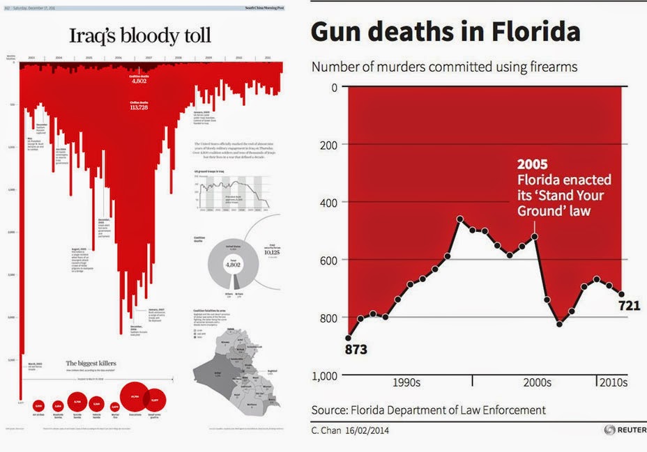 Source: Reuters, via Alberto Cairo’s Blog
In 2005, Florida enacted what is called the “stand-your-ground law”, which allows persons being attacked in a public space to react with possibly lethal force.
If I asked you whether gun deaths have risen or fallen after this law was enacted, what would your immediate answer be?
If you’re like me, you’d probably say “huh, seems like gun deaths have fallen after this law
was enacted. That’s a bit weird.” Like me, you’d be wrong.
There are two factors that, together, make this figure hard to read. First, by convention, we generally
expect the x-axis to be at the bottom of a visualization, and the y-axis to increase in an upward
direction (Hertzsprung-Russell diagram shenanigans notwithstanding). It is therefore logical to
expect that the white area of the plot denote a filled line chart, and the red area the background.
That would be a bit odd (givent that we generally try not to fill the background, if only because ink
is expensive and wasteful).
But okay, we could deal with that, except the authors of this figure have also inverted the y-axis. If you look closely, while the x-axis is still at the bottom (as expected), the zero-point is at the top of the figure, and increased downwards, which messes up our expectations, and therefore our visual cues.
So, have gun deaths really fallen after the law was enacted? No, they’ve risen sharply. But to arrive at this conclusion, we need to expend quite a lot of cognitive effort. This is exactly what we do not want to happen. We want to design our visualizations such that the viewer needs to expend the least amount of cognitive effort in order to understand all relevant pieces of information.
P.A. Fedewa has created an easier-to-read version of the same image:
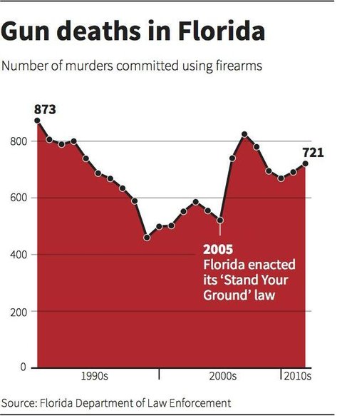 Image Source: P.A. Fedewa, Reuters, via Business Insider
In this version, the rise in gun deaths after the new law was enacted becomes much more obvious at first glance.
So, as a general guideline:
Space
Use (negative) space judiciously and deliberately. Leave enough space for individual visualization elements the relationships between them to be obvious. Make figure-ground organization obvious. Don’t subvert the viewer’s expectations for figure-ground organization and figure elements unless this is part of the visualization’s message.
Key Points
First key point. Brief Answer to questions. (FIXME)