Choosing a Type of Visualization
Overview
Teaching: 10 min
Exercises: 10 minQuestions
What is the difference between continuous, categorical, nominal, ordinal, and proportional data, and how do these different data types affect our choice of visualization?
Objectives
In the previous sections, you have learned a lot about the different concepts that help us design good visualizations, like colour and space, and you have been introduced to the cognitive and psychological concepts that help us design easy-to-read visualizations, like pre-attentive processes and Gestalt psychology.
But all of that does not answer one very important question: How do we pick the right type of visualization for our data set?
Let’s explore this question using an example. Below is a plot showing the average long distance trip length in miles for Thanksgiving (a US holiday), Christmas, and the rest of the year:
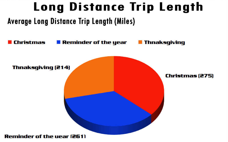 Image Source: WTF Visualizations
Exercise
Do you think this is a good way to visualize this type of data? Why or why not? What type of visualization would you choose?
What would you change to make this more easily readable?
Much has been written about the use and mis-use of pie charts in the data visualization literature. One line of argument goes that humans are generally better at estimating lengths and rectangular areas than we are at estimating angles and arc lengths of a circle, which is how differences in value of different categories are encoded in pie charts.
Regardless of your thoughts about pie charts in general, this is not a good use of them. Why? Because pie charts generally describe parts-to-whole relationship. For example, you could look around the classroom, and query everyone’s home institution, and then make a pie chart of the percentage of participants coming from each institution. This makes sense, because it describes a part-to-whole relationship: if three out of ten students are enrolled at the University of Washington, I can make a pie slice that encompasses 30% of the pie. This will make sense, because this inherently implies that 70% of students are enrolled somewhere else, which is true.
This no longer becomes true for data sets that do not describe part-to-whole relationships, like in the case above. Average trip length is just a number, it isn’t measured relative to anything whole. A better use for a pie chart would be, for example, if this chart depicted the fraction of time travelled for Christmas, Thanksgiving, and the rest of the year, relative to the average total time that people spend travelling.
This kind of mistake can also be commonly seen in questionnaires, where people are allowed to check multiple answers. If you have a survey that says, for example, that 80% of people like ice cream, and 60% of people like cake, and 75% of people like chocolate, then representing this as a pie chart will be confusing, because what does it mean for the percentages to sum up to 215%? It just means that lots of people like all three!
A better way to represent this data would be a bar chart:
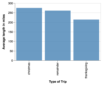
You can find the code to generate this visualization [in the corresponding notebook][triplength_notebook]. While the bar chart is much less exciting, it is also much easier to see whether the longest distances are travelled for Thanksgiving, Christmas, or the rest of the year, something that isn’t immediately apparent in the pie chart without the numbers (especially with the 3D perspective added in!).
Types of Data
So far, I’ve mostly asserted that the bar chart would be a better type of visualization for this kind of data, but I’ve not told you how I got there.
The first step to designing a good visualization is to ask yourself: what important information does my data contain? And this is closely related to the different types of data you might encounter.
One important distinction is between continuous and discrete data. Continuous data describes all those measurements that encode a continuous variable, like for example temperature, or brightness. Discrete data, often also called categorical data, generally comes in two separate flavour: nominal data describes a set of unordered categories (like the different types of trips above), whereas ordinal data describes categories in a fixed order, like for examples the months of the year.
Line charts and scatter plots are often used for continuous data types, bar charts and pie charts are often used for categorical data. This is not a hard-and-fast rule, however. Using line charts for categorical data can be confusing, because people tend to intuitively interpolate between the values on the X-axis, which might not make sense in all cases (what would be the interpolation between “christmas” and “Thanksgiving” in our example above? You can use line charts for categorical data, but this requires a little bit more thought on the part of the viewer, so as a designer you need to take extra care to highlight the axis labels in a way that helps the viewer understand that the variable on the X-axis is categorical.
Proportional data, i.e. data where the sum of all parts make up 100%, is a special type of categorical data. Fundamentals of Data Visualization by Claus O. Wilke has a great section on visualizing proportions, and also cases where pie charts fail even when the data is proportional.
For continuous data, there is an important question to ask: is the important information in the absolute values of my data points, or in the relative differences between data points? This is closely related to another important question: Do I need to include the zero-point on the y-axis, or not?
One example is this chart about the average annual global temperature, shared by the National Review:
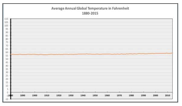
This chart is supposed to show that climate change is, supposedly, not real, since the annual temperatures have barely changed over the past hundred years.
This chart is, technically, correct: it contains all the data. But it is also misleading to the point of being useless. Scientists generally agree that a change of 2 degrees Fahrenheit has a significant impact on our climate. On a scale of 0 to 110, these differences will never show up! Including zero points when relative differences are important can be very misleading.
However, this does not mean you should never include zero points: The UW class Calling Bullshit has a great discussion of this case, as well as the reverse case: bar charts that do not start at zero, leading to very confusing and misleading estimations of the actual relative differences between different categories.
Choosing A Visualization Type
So where does this leave us? Bar charts, line charts and pie charts in themselves are confusing enough! But beyond these types, there are dozens more!
Fear not, for there are resources that help you! One of the best ones out there is the Data Visualization Catalogue. You can search by function (whether you’re trying to show a part-to-whole, distribution, comparison, time series, etc. relationship), or by type of data visualization, and the website will give you suggestions for what type of visualization to use for what purpose.
For example, take a look at the entry for “Proportions”:
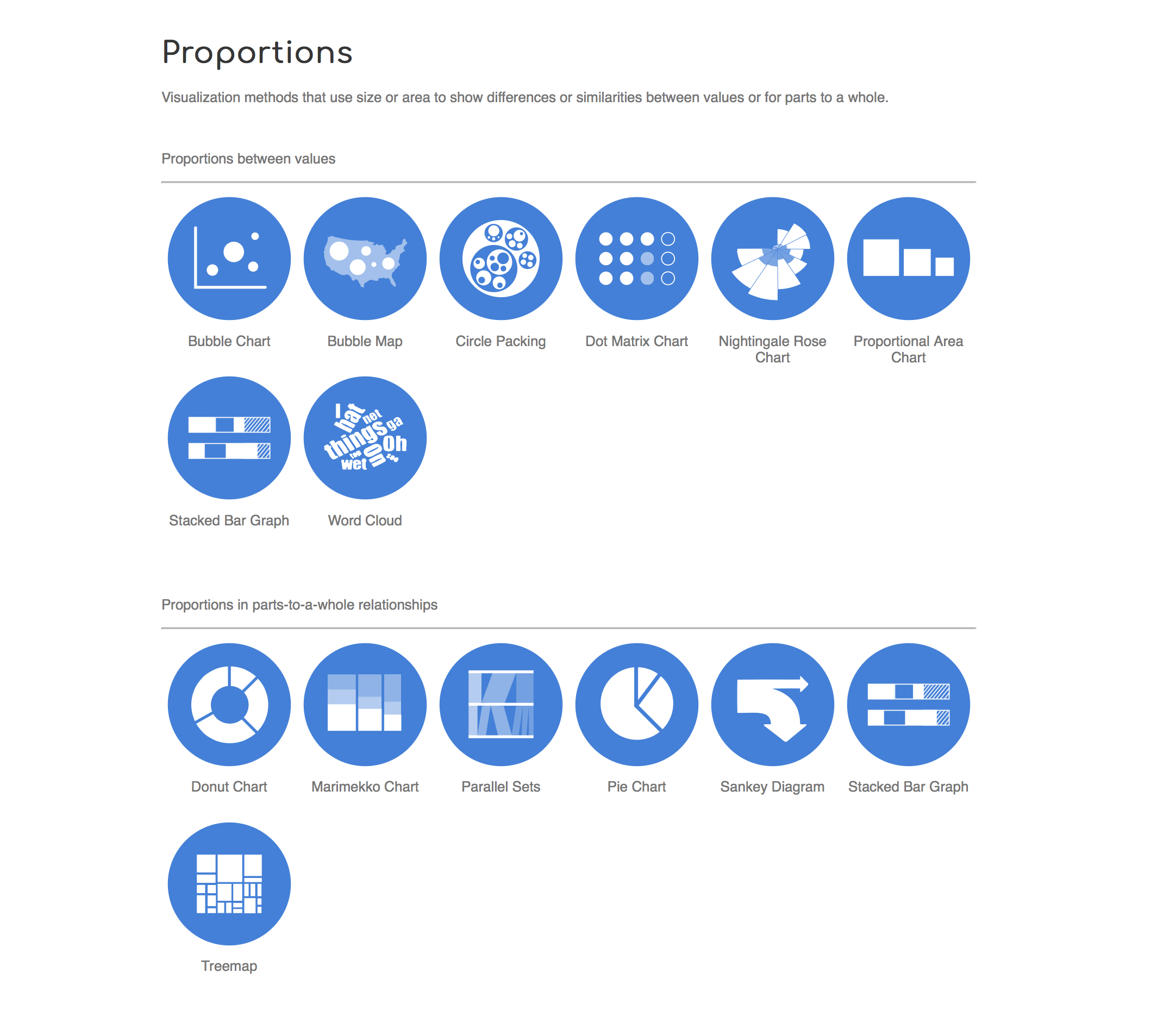 Image Source: Screen shot of Proportions page on www.datavizcatalogue.com
Here, you have to decide whether to look at proportions between numbers (like in our pie chart example above), or in parts-to-whole relationship (exactly what we didn’t have above!). If you click on “pie chart”, the resulting website will give you examples, a description and the advantages and drawbacks.
Exploring the Catalogue
Take a look around the data visualization catalogue. Which types of visualizations are you familiar with? Which ones are new to you?
Are there other types of data visualizations you think would be useful for the trip length data above?
What types of functions do you usually tend to display in your own work? What types of visualizations do you usually use to display them? Are there good alternatives in the catalogue you think would be worth trying out?
Key Points
Be careful to tailor your choice of visualization to the type of data and the type of information you are trying to convey
Pie charts only work for parts-to-whole relationships, i.e. proportional data
If relative differences are important in line charts, including the zero-point can be misleading.
In bar charts, the area of the bar is proportional to the value displayed, thus leaving out the zero point in these types of charts can lead to confusion.